
README file from
GithubScriptorium
A quiet desk for long thoughts.
A warm, minimal Obsidian theme for long-form reading and writing.
Scriptorium keeps the writing surface primary: soft paper tones, restrained contrast, quiet workspace chrome, flatter tags and callouts, and typography tuned for mixed CJK and Latin notes.
Paper, light and connections: Scriptorium shares quiet shapes and a visual rhythm with Desk Lamp and Skill Switchboard. Each product works independently; neither plugin is required to use the theme.
[!NOTE] Scriptorium is a personal aesthetic. It does not aim to support the
Style Settingsplugin.
Preview
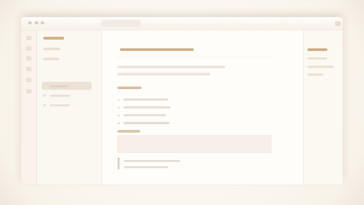
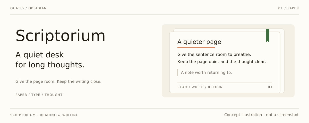
Layout illustration, not an in-app screenshot. The cover above is also concept artwork; the active theme, fonts and your settings determine the appearance inside Obsidian.
Install
- Search for
Scriptoriumin Obsidian Community Themes. - Click Install and use.
Manual install: copy theme.css and manifest.json into .obsidian/themes/Scriptorium/, then select Scriptorium in Appearance -> Themes.
Design
- Scriptorium is drawn in the IBM Plex family — install IBM Plex Sans, IBM Plex Serif and IBM Plex Mono (or the full IBM Plex release) and they apply automatically.
- Set a different font in Appearance and your choice leads the stack; IBM Plex and the CJK fallbacks follow.
- Document surfaces stay light: texture, shadow, and accent color are deliberately restrained.
- Navigation, search, menus, tags, callouts, and embeds stay quiet so prose remains central.
- The theme ships as a single
theme.csswith no external dependencies.
Design Principles
Guidelines the theme is edited against, kept for future maintenance:
- Keep the warm paper palette restrained.
- Keep the surface clean enough that texture supports the page instead of competing with it.
- Prefer typographic hierarchy over heavy chrome.
- Keep auto-hide behavior limited, predictable, and easy to ignore when reading.
- Use accent colors carefully when they carry semantic meaning in body-sized text.
- Keep callouts, embeds, and floating UI aligned with the same material language, but avoid making routine operational UI feel like stacked cards.
- Keep tags quiet enough to annotate prose without competing with headings or links.
- Treat reading comfort as more important than decorative novelty.
Development
The readable source lives in src/theme.css. Edit it, then run npm run build — esbuild minifies it into the shipped theme.css, which keeps the file lean for the community-store size check. npm run lint runs stylelint against the source.
Personal adjustments go through CSS snippets — snippet-example.css is a commented tour of the tokens a snippet may safely touch, with the palette ramps and the override tiers explained.