
README file from
GithubDesign Philosophy
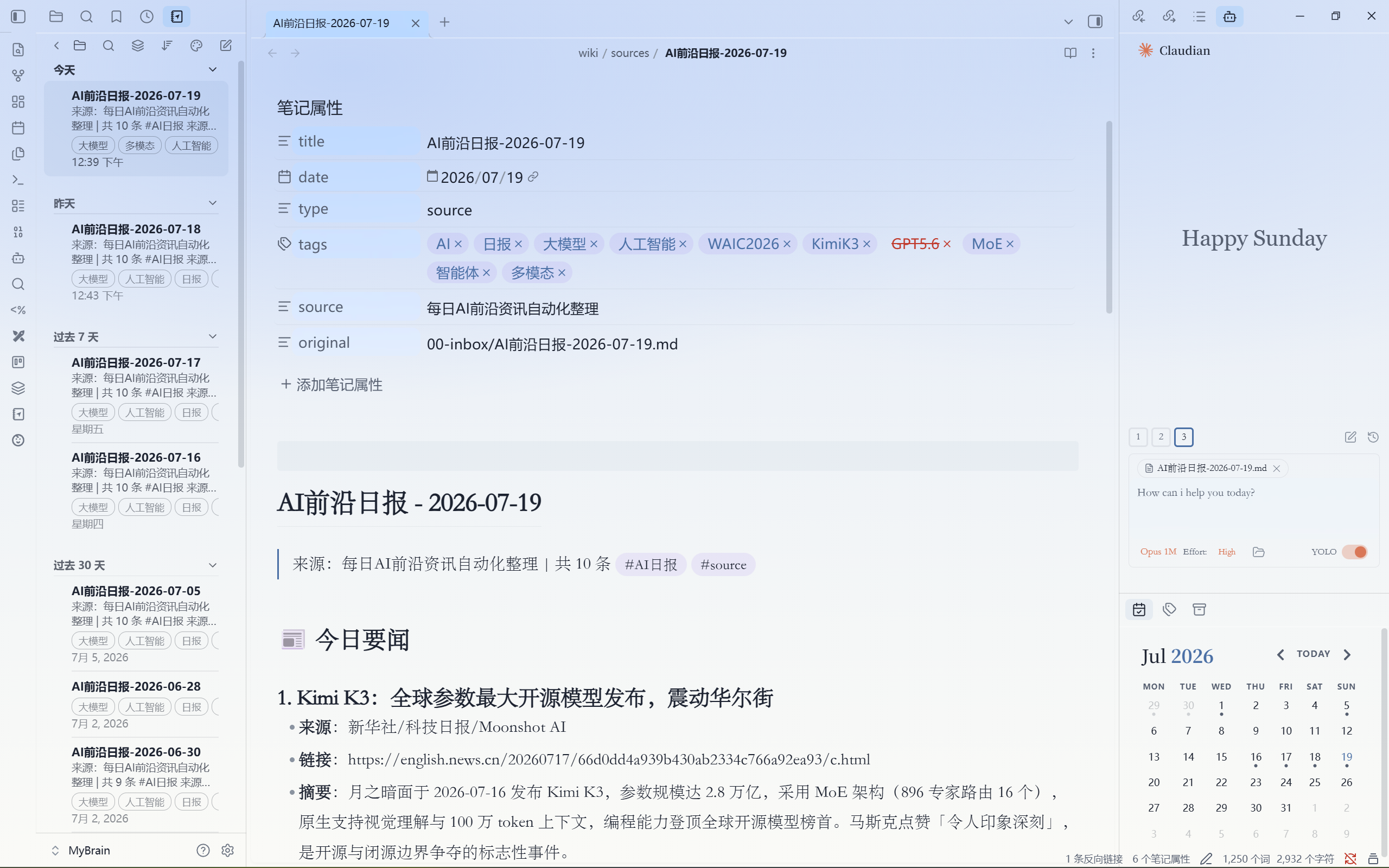
Glass Scholar is an Obsidian theme that blends Apple's Liquid Glass design language with academic-grade typography. It treats the entire Obsidian workspace as a single continuous sheet of frosted glass — radiant color glows permeate every panel through pure-CSS radial gradients, while subtle blur, specular rim highlights, and siphoned neon edge blooms create a premium multi-layered material feel.
Think of it as macOS × LaTeX: the depth and translucency of Apple's latest design system, wrapped around a distraction-free, paper-quality reading & writing environment.
✨ Key Design Features
🌈 Self-Contained Micro-Glow Popups
Every popup, menu, command palette, and suggestion container carries its own 4-corner balanced radial-gradient micro-glow, sampled from the active wallpaper's color palette via --gs-glow-* CSS variables. This means popups look identically stunning regardless of your glow intensity setting — a breakthrough solution to Electron's backdrop-filter rendering quirks.
🪟 True Frosted Glass, Not Just Opacity
- Layered translucent backgrounds: SVG fractal-noise texture + multi-stop linear-gradient + radial color blooms, all stacked to simulate real etched glass grain.
backdrop-filter: blur()at calibrated radii (32–48px for popups, 24px for panels) provides the depth blur without washing out.- Specular rim highlights:
inset 0 0 0 0.5pxhairline glow rings around all floating surfaces — the "edge luminescence" that defines Apple glass. - Siphoned neon edge bloom: popup box-shadows pull the wallpaper's
--gs-glow-1primary color, creating a colored halo that shifts with your chosen palette.
🚫 Zero-Border, Zero-Hard-Edge
No border: 1px solid anywhere in the interface. Panels are separated purely by transparency depth, subtle inset shadow rims, and translucent resize handles — the workspace feels like one uninterrupted piece of glass.
🍎 Apple HIG Icon Micro-Interactions
All native Obsidian icon buttons (ribbon, tab headers, view actions, nav buttons, status bar, file explorer, graph controls, and Notebook Navigator plugin) feature:
| State | Light Mode | Dark Mode | Effect |
|---|---|---|---|
| Default | Transparent, muted | Transparent, muted | Silent, no visual weight |
| Hover | rgba(0,0,0,0.055) + 12px blur |
rgba(255,255,255,0.085) + 14px blur |
Glass capsule appears, scale(1.08) spring, specular top rim |
| Active | Deeper glass | Deeper glass | scale(1.0) press-down + translateY(0.5px) depression |
This adaptive light/dark hover strategy follows the Apple HIG principle that Liquid Glass on dark backgrounds should auto-brighten.
📖 Academic Typography (gs-use-serif class toggle)
- Serif body (optional): Source Serif 4 → Noto Serif SC → Songti
- Justified alignment (
gs-justify): truetext-align: justifywithhyphens: auto - First-line indent (
gs-indent): 2em paragraph indent - Drop cap (
gs-dropcap): first paragraph lead-in - Academic three-line tables: bold top/bottom rules, subtle header separator
- Adjusted line-height (1.4–2.2, default 1.85) and measure width (56–100ch, default 72ch)
🌗 Auto Light/Dark Mode
themeScheme: "auto" in manifest.json — follows your OS preference. Both modes have fully independent color palettes with matched glow, text, and accent variables.
📦 8 Wallpaper Color Presets
| Dark (深色底) | Light (浅色底) |
|---|---|
| 幻夜蓝 Midnight Blue | 晨曦蓝 Daybreak Blue |
| 紫罗兰 Violet | 薰衣草 Lavender |
| 暮霞 Sunset Rose | 樱粉 Sakura Pink |
| 森林 Forest Green | 薄荷 Mint |
All generated as pure CSS radial gradients — zero image loading, zero network requests. The wallpaper SVG files in the theme folder are alternative choices, not required for the core effect.
📄 PDF Export
Dedicated @media print ruleset strips all glass effects, transparency, and blur, resetting to clean black-on-white block layout for academic paper output.
📱 Mobile Responsive
@media (max-width: 768px) adapts font sizes, workspace padding, and auto-hide ribbon behavior for phones and tablets.
🔧 Installation
From Obsidian Community Theme Store (recommended)
- Open Obsidian → Settings → Appearance → Themes → Browse
- Search "Glass Scholar"
- Click install & enable
Manual
- Download
theme.cssandmanifest.jsonfrom Releases - Create folder
<vault>/.obsidian/themes/Glass Scholar/ - Copy both files into it
- Obsidian → Settings → Appearance → Themes → select Glass Scholar
⚙️ Style Settings (requires Style Settings plugin)
| Category | Setting | Type | Default | Description |
|---|---|---|---|---|
| Background Glow | 光晕配色 | Select | Daybreak Blue | Wallpaper color preset (8 options) |
| 光晕模糊 | Slider 0–120 | 40px | Larger = softer color bloom | |
| 光晕强度 | Slider 0.2–1.6 | 1.0 | Glow layer opacity | |
| UI Behavior | 自动隐藏侧边工具栏 | Toggle | Off | Auto-hide left ribbon, reveal on hover |
| Typography | 正文使用衬线字体 | Toggle | Off | Serif body font |
| 两端对齐 | Toggle | On | Justified text | |
| 段首 2em 缩进 | Toggle | On | Paragraph indent | |
| 首段首字母下沉 | Toggle | Off | Drop cap on first paragraph | |
| 行距 | Slider 1.4–2.2 | 1.85 | Line height | |
| 正文最大宽度 | Slider 56–100 | 72ch | Measure width |
🧩 Recommended Plugins
- Style Settings — Visual config for all theme options
- Translucent Background — Window-level transparency (makes the glow visible through the OS window chrome)
🔠 Typography Stack
The theme uses local system fonts only — no remote font loading, zero network dependency:
| Role | Font Stack |
|---|---|
| UI | SF Pro → PingFang SC → Microsoft YaHei → system-ui |
| Body | System default (serif mode: Source Serif 4 → Noto Serif SC → Songti) |
| Code | JetBrains Mono → SF Mono → Menlo → Consolas → monospace |
📋 Compatibility
| Platform | Status |
|---|---|
| Windows / macOS / Linux Desktop | ✅ Full support |
| iOS / iPadOS Mobile | ✅ Adapted |
| Android Mobile | ✅ Adapted |
| Obsidian ≥ 1.0.0 | ✅ Required |
💝 Sponsor
If this theme enhances your daily writing experience, consider supporting its continued development:
Your support helps fund design iterations, cross-platform testing, and new wallpaper presets. Every contribution — no matter the amount — is deeply appreciated. ❤️
📄 License
MIT © 2026 Glass Scholar
设计理念
Glass Scholar 是一款融合了 Apple 液态玻璃(Liquid Glass)设计语言 与 学术论文级排版 的 Obsidian 主题。它将整个 Obsidian 工作区视为一张连续的磨砂玻璃——纯 CSS 径向渐变的彩色光晕穿透每一层面板,而微妙的毛玻璃模糊、镜面高光内缘和虹吸霓虹边缘光则营造出一种高级的多层次材质感。
你可以把它想象为 macOS × LaTeX:Apple 最新设计体系的深度感与通透感,包裹着一个无干扰、纸张品质的阅读与写作环境。
✨ 核心设计亮点
🌈 弹窗自带微型光晕(独创方案)
每个弹窗、菜单、命令面板和建议容器都携带着自己的 四角对称径向渐变微型光晕——颜色取自当前壁纸调色板的 --gs-glow-* CSS 变量。这意味着无论你把光晕强度调到多低,弹窗都能保持一致的流光溢彩磨砂质感。这是在 Electron 渲染限制下的一次突破性方案创新。
🪟 真·磨砂玻璃,不止是不透明度
- 多层堆叠的半透明背景:SVG 分形噪点纹理 + 多段线性渐变 + 径向彩色光斑,全部叠加在一起模拟真实的磨砂玻璃颗粒感。
- 校准后的
backdrop-filter: blur()半径(弹窗 32–48px、面板 24px)提供深度模糊但不过度洗白。 - 镜面边缘高光:所有浮动面板的
inset 0 0 0 0.5px极细环形光——这就是 Apple 玻璃标志性的"边缘微光"。 - 虹吸霓虹边缘光:弹窗的
box-shadow引用壁纸--gs-glow-1主色调,形成随壁纸变换的彩色光晕。
🚫 零边框、零硬边缘
界面中没有任何 border: 1px solid。面板完全依靠透明深度、微妙的 inset 阴影内缘和半透明的拖拽手柄来区分——整个工作区就像一整块无接缝的玻璃。
🍎 Apple HIG 图标微交互
所有 Obsidian 原生图标按钮(丝带栏、标签页头部、视图操作、导航按钮、状态栏、文件浏览器、图谱控制、以及 Notebook Navigator 插件图标)均具备:
| 状态 | 浅色模式 | 深色模式 | 效果 |
|---|---|---|---|
| 默认 | 透明、低存在感 | 透明、低存在感 | 完全静默,无视觉负担 |
| Hover | rgba(0,0,0,0.055) + 12px 模糊 |
rgba(255,255,255,0.085) + 14px 模糊 |
玻璃胶囊浮现 + scale(1.08) 弹性放大 + 顶部镜面高光 |
| 按下 | 更深的玻璃色 | 更深的玻璃色 | scale(1.0) 回缩 + translateY(0.5px) 下沉 |
深色模式使用白色基底(而非暗色),遵循 Apple HIG 中"暗色背景上的玻璃应自动提亮"的原则。
📖 学术论文级排版(gs-use-serif 开关)
- 衬线正文(可选):Source Serif 4 → Noto Serif SC → 宋体
- 两端对齐(
gs-justify):真正的text-align: justify+hyphens: auto - 段首缩进(
gs-indent):2em 段落首行缩进 - 首字母下沉(
gs-dropcap):首段英文首字母下沉 - 学术三线表:顶部底部加粗、表头下细线分隔
- 可调行距(1.4–2.2,默认 1.85)和版心宽度(56–100ch,默认 72ch)
🌗 自动浅色/深色双模式
manifest.json 中设置为 themeScheme: "auto"——自动跟随系统外观偏好。两种模式拥有完全独立的色彩体系,变量一一对应。
📦 8 种壁纸光晕配色
| 深色底 | 浅色底 |
|---|---|
| 幻夜蓝 Midnight Blue | 晨曦蓝 Daybreak Blue |
| 紫罗兰 Violet | 薰衣草 Lavender |
| 暮霞 Sunset Rose | 樱粉 Sakura Pink |
| 森林 Forest Green | 薄荷 Mint |
全部使用 纯 CSS 径向渐变 生成——零图片加载、零网络请求。主题文件夹内的 SVG 壁纸文件为备选,核心效果无需它们。
📄 PDF 导出
专属 @media print 规则:清除所有玻璃效果、透明度与模糊,重置为纯净的黑白块状排版,适合学术论文/报告导出打印。
📱 移动端适配
@media (max-width: 768px) 自动调整字号、工作区间距、丝带栏自动隐藏行为,适配手机与平板。
🔧 安装
从 Obsidian 社区主题市场安装(推荐)
- 打开 Obsidian → 设置 → 外观 → 主题 → 浏览
- 搜索 "Glass Scholar"
- 点击安装并启用
手动安装
- 从 Releases 下载
theme.css和manifest.json - 放入
<你的仓库>/.obsidian/themes/Glass Scholar/ - Obsidian → 设置 → 外观 → 主题 → 选择 Glass Scholar
⚙️ Style Settings 配置(需安装 Style Settings 插件)
| 分类 | 设置项 | 类型 | 默认值 | 说明 |
|---|---|---|---|---|
| 背景光晕 | 光晕配色 | 下拉选择 | 晨曦蓝 | 8 种壁纸色彩主题 |
| 光晕模糊 (px) | 滑块 0–120 | 40 | 越大光晕越柔和 | |
| 光晕强度 | 滑块 0.2–1.6 | 1.0 | 光晕层整体透明度 | |
| 界面行为 | 自动隐藏侧边工具栏 | 开关 | 关闭 | 完全收起,鼠标触边滑出 |
| 论文排版 | 正文使用衬线字体 | 开关 | 关闭 | 开启后正文切换为衬线 |
| 两端对齐 | 开关 | 开启 | 文字左右两端对齐 | |
| 段首 2em 缩进 | 开关 | 开启 | 段落首行缩进两字符 | |
| 首段首字母下沉 | 开关 | 关闭 | 英文首段首字母下沉效果 | |
| 行距 | 滑块 1.4–2.2 | 1.85 | 正文行间距 | |
| 正文最大宽度 (ch) | 滑块 56–100 | 72 | 版心字符宽度 |
🧩 推荐搭配插件
- Style Settings — 可视化配置所有主题选项
- Translucent Background — 窗口级透明增强(让光晕穿透操作系统窗口边框)
🔠 字体体系
主题 仅使用系统本地字体,无任何远程加载依赖:
| 用途 | 字体链 |
|---|---|
| 界面 | SF Pro → PingFang SC → 微软雅黑 → system-ui |
| 正文 | 系统默认(衬线模式:Source Serif 4 → Noto Serif SC → 宋体) |
| 代码 | JetBrains Mono → SF Mono → Menlo → Consolas → monospace |
📋 兼容性
| 平台 | 状态 |
|---|---|
| Windows / macOS / Linux 桌面端 | ✅ 完整支持 |
| iOS / iPadOS 移动端 | ✅ 已适配 |
| Android 移动端 | ✅ 已适配 |
| Obsidian ≥ 1.0.0 | ✅ 最低要求 |
💝 支持与赞助
如果本主题为你的日常写作带来了更好的体验,欢迎请我喝杯咖啡,支持它的持续开发与维护:
你的支持将帮助支付设计迭代、跨平台测试和新增壁纸配色的开发成本。每一份赞助,无论金额大小,都深表感谢。❤️
🏗️ 技术架构
主题采用 纯 CSS 单文件架构(theme.css + manifest.json),零依赖、零构建:
Glass Scholar/
├── manifest.json       ← Obsidian 主题元数据
├── theme.css           ← 全部样式(变量 / @settings / 组件覆盖)
├── README.md           ← 本文件
└── wallpaper*.svg      ← 8 个备选径向渐变壁纸(纯 CSS,非必须)
架构决策
- 纯 CSS 径向渐变光晕:不使用图片文件作为壁纸,
body::before伪元素 + 4 层radial-gradient()叠加 +filter: blur()晕染生成所有光晕效果。CSS 变量--gs-glow-1~4和--gs-glow-base控制颜色,Style Settings 下拉切换类名。 - 面板透明策略:
:root中将--background-primary等 4 个 Obsidian 背景变量设为transparent,通过递归选择器(.mod-left-split *)对侧边栏和主内容区所有子元素强制执行透明,让底层光晕直穿。弹窗内部用独立规则固化这些变量为实色,防止透底。 - 弹窗自包含光晕(v1.1 创新):弹窗的不依赖
backdrop-filter采样背后的body::before光晕,而是在自己的background中内联渲染一小套径向渐变光晕——颜色引用同一组--gs-glow-*变量。这解决了 Obsidian Electron 环境下弹窗 overlay 层的渲染限制问题。 - 图标交互:Apple 风格的图标 hover 效果分浅色/深色两套,使用自适应色调(浅色微暗、深色微亮),配合
backdrop-filter: blur(12-14px)+scale(1.08)弹性动画 + 顶部镜面高光内缘。
📄 开源协议
MIT © 2026 Glass Scholar